Nonprofit donation website design is the process of building a clear path from your mission to a completed gift, with a prominent donate button, a short form, secure payment, and a confirmation page. That path matters because most visitors never give: across all traffic sources, only 1.6% of visitors made a donation in M+R Benchmarks 2026 data. Every step between arriving and giving is a place where people leave, so the path should be measurable step by step, not just attractive.
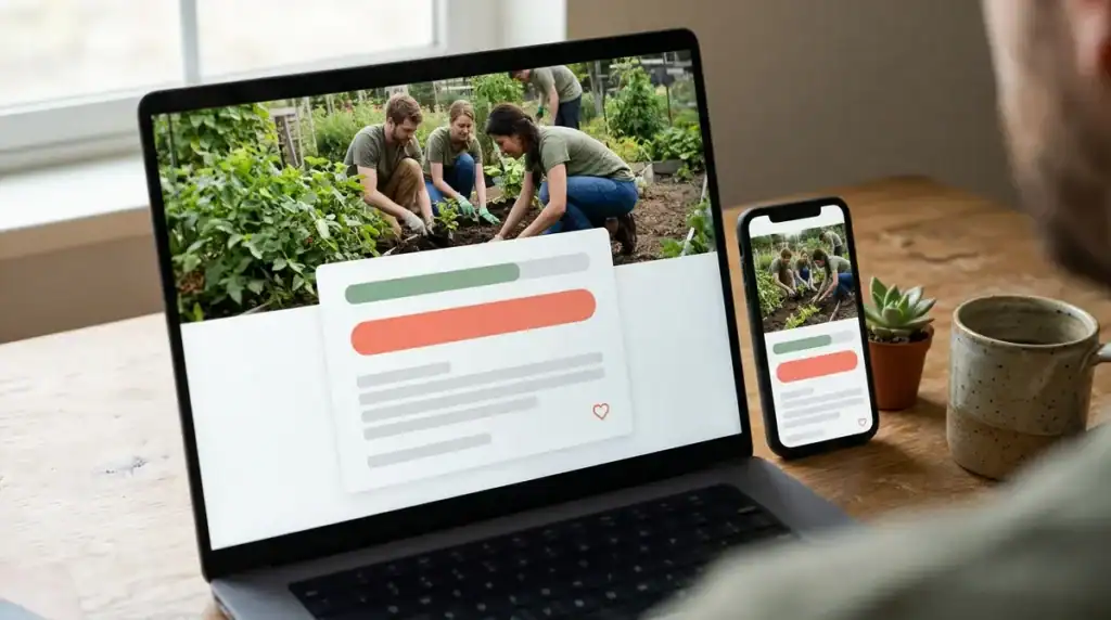
Mobile deserves the most attention. In the same benchmarks, 11% of desktop users who reached a primary donation page completed a gift, compared with 8% of mobile users, and small nonprofits’ mobile conversion fell to 4%. Mobile devices accounted for 52% of nonprofit website traffic but only 43% of donation transactions, so a page built for a large monitor first will lose gifts on the phones where many of your supporters already are. Thumb-friendly buttons, fast load times, and short forms are where the work begins for organizations in Greensboro, North Carolina, and beyond.
Key Takeaways
- Nonprofit donation websites should be measured step by step, because across all traffic sources only 1.6% of visitors made a donation in M+R Benchmarks 2026 data.
- Nonprofit donation pages should be designed for mobile first, because 8% of mobile users who reached a primary donation page completed a gift compared with 11% of desktop users in M+R Benchmarks 2026 data.
- Nonprofit donation forms should offer three or four preset amounts beside a custom option, a one-time and monthly giving choice, and only the fields needed to process the gift and send a receipt.
- Nonprofit donation receipts must include the organization’s name, the cash amount, and a statement about any goods or services received for gifts of $250 or more, so the receipt template should be built before launch.
- North Carolina charities with a website that asks the public for donations may need a license from the Secretary of State’s Charitable Solicitation Licensing Section, subject to statutory exemptions, so license status should be confirmed before the donate button goes live.
How Does a Nonprofit Donation Website Work?
A nonprofit donation website works as a sequence of steps: a mission statement that explains the need, a donate call to action, a short form, secure payment, a confirmation page, and a follow-up message. Each step is a point where a visitor can stop, so the path should be measured step by step rather than treated as a single page you launch and forget. M+R Benchmarks 2026 puts the average at $1.33 per website visitor, so the value of each visitor depends on how many of them reach the end of the path.
The mission comes first. If visitors cannot tell within seconds what your organization does and why a gift matters, they have no reason to look for the donate button. The call to action should follow directly and stay easy to find on every page.
The form is where many donors quit. Nielsen Norman Group’s research on nonprofit and charity websites emphasizes clear information, donor trust, and careful design of the donation process itself. Ask only for what you need to process the gift and send a receipt.
Payment is the next drop-off point. Card processing typically adds a percentage plus a fixed charge per transaction, such as 2.9% plus $0.30 for cards, so the payment platform changes what each gift nets. Those fees are separate from the cost of building the site.
Confirmation and follow-up close the loop. A confirmation page should state the gift amount and what happens next, and a receipt email should follow. Google Tag Manager can record events such as form submissions and phone taps, so you can see how many visitors reach each step and where the numbers fall off.
Why Does Mobile Design Matter Most for Donations?

Mobile deserves priority because phones bring in a large share of visits but convert less often than desktop. In the same benchmark data, 11% of desktop users who reached a primary donation page completed a gift, compared with 8% of mobile users, and small nonprofits’ mobile rate dropped to 4%. A donation page that works well only on a large monitor leaves much of its audience behind.
The revenue numbers show what that gap costs. Mobile devices accounted for 28% of donation revenue but 43% of donation transactions. Phone donors are giving, so every lost mobile completion is a gift the page never collects.
Page speed is the first place mobile visitors tend to leave. Many supporters reach your site on cellular connections, and each extra second before the donate button or form appears gives them another reason to close the tab. Compress images, keep the donation page free of heavy scripts, and be cautious with third-party widgets, since each one adds load time before the form is usable.
Form design matters just as much once the page loads. Preset gift amounts should be large buttons with enough space between them that a thumb can tap one without hitting its neighbor. Use a single-column layout so that fields stack vertically and the keyboard does not cover the field being typed in. Phones should also open the right keyboard for each field, a numeric keypad for the amount and an email keyboard for the address, and the form should support browser autofill so donors do not retype their details.
Testing has to happen on real devices during the design stage, not only in a desktop browser preview. A preview can show whether a layout looks right, but it cannot reveal a sticky header that hides the submit button, a keyboard that covers the card field, or a payment window that fails to return to your confirmation page. Check the flow on both iPhone and Android phones, in both common browsers, and at more than one screen size. With WordPress sites, test each plugin that touches the donation step, since a plugin update can change how the form behaves on a phone.
Where Should the Donate Button and Navigation Go?
Place one donate button in the header of every page, and keep it visible as visitors scroll on both desktop and mobile. On a phone, a fixed header with a short label such as “Donate” lets a reader give at any point without opening a menu. The header must not cover the top of the form or the submit button, so test the sticky behavior on real phones before launch.
Keep the primary navigation short so the donation path is not buried under secondary items. Five or six top-level links is a practical limit for most nonprofits. A menu for a Greensboro charity might read:
- Our Mission
- Programs
- Stories
- Events
- Get Involved
- Contact
Move everything else, such as annual reports, board pages, and policies, into the footer, where visitors who want them can still find them.
Story and program pages are where many readers decide whether to give, so each one should end with the same call to action. Use one label, such as “Donate now,” and link it to the donation page. Pair it with a specific line about what a gift does, like the cost of a month of meals at a program site, so the button connects to a clear outcome. If one page says “Donate now” and another says “Give today,” readers may wonder whether they have reached the same organization’s donation path.
Avoid competing donation buttons on the same screen. A header button labeled “Donate,” a banner reading “Support us,” and a sidebar reading “Make a gift” all ask for the same decision. Keep one donation label and repeat it, and present other involvement, such as volunteering, as text links further down the page.
Track clicks on each donate button with Google Tag Manager, broken down by page. If the program pages send few readers to the form, the button placement or the surrounding copy on those pages needs work.
What Should a Donation Form Include?
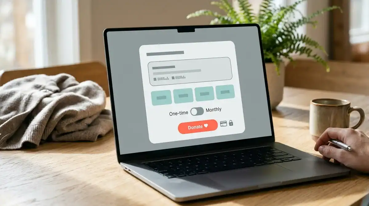
A donation form should offer suggested amounts with a custom option, a plain choice between one-time and recurring giving, a matching gift prompt where it applies, several payment methods, and only the fields needed to process the gift and send a receipt. Each element removes a reason for a donor to stop.
Suggested amounts work best as three or four preset buttons beside a custom amount field. Too many choices slow the decision, and a donor faced with a long list often picks none. Where possible, tie each amount to a specific outcome, such as the cost of a month of meals at a program site, so the number connects to something the donor can picture.
Recurring giving should sit next to the one-time option, not inside a second step. Name the frequency in plain words, such as “Give monthly,” and state when the first charge happens and how a donor can cancel. Monthly supporters are often the most valuable, so the choice deserves the same visibility as the one-time button.
Matching gifts need a short note near the amount field. If a donor’s employer runs a matching program, the form should say so and explain the next step: the donor contacts HR or the company’s giving portal to request the match, usually after the gift is complete. Many donors do not know their employer offers matching, so this line can unlock gifts that would otherwise never be made.
Ask only for what the gift requires. In most cases that means:
- Name and email address for the receipt
- Gift amount and frequency
- Payment details
A mailing address belongs on the form only if you send printed paperwork that needs one. Gifts of $250 or more also need a written acknowledgment from the organization, as the IRS explains, which must include the organization’s name, the amount, and a statement about any goods or services the donor received in return. Build the receipt template before launch so it meets that standard.
Offer cards, bank transfers, and digital wallets such as Apple Pay or Google Pay wherever your platform supports them. Many donors prefer one method over another, and a missing option can end a checkout that would otherwise finish. Compare the total cost of each option, since fundraising platforms often add their own fee on top of card or bank processing charges.
Which Trust Signals Help Donors Give With Confidence?
Donors give with confidence when the site looks secure, looks like one organization everywhere they meet it, and shows what their money accomplishes. A secure connection protects the gift, a consistent brand makes the organization recognizable, and specific proof of impact gives a reason to finish.
Start with the connection. Every page that collects a name, email address, or card number should load over HTTPS, and the padlock and secure label should be visible on the donation page and again in the checkout step. If the connection status appears only after payment, donors may wonder whether their card details were safe while they typed them. Dig Designs’ Website Management plans include a free SSL certificate, daily malware and vulnerability scanning, and daily off-site backups, and these protections apply while the plan is active.
Usability research supports this emphasis on visible trust. The research behind 116 design guidelines ran two rounds of U.S. usability testing on 60 nonprofit, charity, and association websites, and it centers on clear information and donor trust. A mismatched logo or a payment page that looks unlike the rest of the site can make a donor pause before entering a card number.
Consistency starts with the logo, colors, and typography. Use the same logo files, color values, and fonts on the website, in printed appeal letters, on event banners, and in social media graphics. A donor who receives a mailed letter and then lands on a site with a different typeface may not connect the two.
Write those rules down. A short style guide should list the logo versions and minimum sizes, the exact color values, the heading and body fonts, and examples of approved button styles. Store it where your staff, volunteers, and web team can find it, so each new campaign page starts from the same rules.
Impact proof persuades more than mission language. Instead of “your gift helps families in our community,” write what a specific gift pays for, such as school supplies for one student or a training session for one volunteer. Name the program, state the outcome, and add a photo of the work where consent allows. Refresh these examples each season so donors can see what their gifts did.
What Should Happen After a Donor Gives?

Right after a gift, the donor should land on a confirmation page that thanks them, repeats the gift amount, and explains what happens next. A line such as “Your $50 monthly gift is active, and your first receipt is on its way to your inbox” tells the donor the payment went through and where to look for proof. That single line also prevents many support emails asking whether the card was charged.
Send the email receipt immediately after the gift, not in a batch at the end of the week. Store a copy in the donor record so staff can find it when a donor asks for one months later.
Federal rules add a requirement for larger gifts. For a contribution of $250 or more, the organization must provide a written acknowledgment that includes its name, the cash amount or a description of any noncash property, and a statement about any goods or services the donor received in return. Build this template before launch, because a receipt that omits any of these items can leave a large donor without the documentation they need for their tax records.
Connect the donation form to your donor database so every gift creates or updates a record automatically. When staff copy amounts by hand from payment reports, errors appear, and recurring gifts are easy to lose track of. A linked database keeps each donor’s giving history, recurring schedule, and communication preferences in one place, so a monthly donor who cancels stops receiving renewal appeals.
Plan follow-up messages before launch, not after the first gift arrives. A short thank-you email can go out within a few days, followed by an update several weeks later that names the program the gift supported and reports what it accomplished. The final message should invite one clear next step, such as a monthly gift, a volunteer sign-up, or attendance at an event, so the donor has a reason to return.
Measure the follow-up as well as the form. Tag the thank-you page in Google Tag Manager so you can see how many donors reach it, then compare how many later give again after each message in your sequence.
Are Accessibility and Licensing Part of the Build?
Yes, both belong in the build. A donation page that a keyboard or screen reader user cannot complete loses gifts, and North Carolina may require a license before your site asks the public for money.
Title III of the Americans with Disabilities Act applies to businesses open to the public. The U.S. Department of Justice states that its web-accessibility guidance does not set detailed technical standards, and it identifies WCAG as helpful technical guidance.
WCAG 2.2 is the version the World Wide Web Consortium published as a Recommendation on October 5, 2023, adding nine success criteria compared with WCAG 2.1.
Test the donation form before launch with a keyboard alone. Every preset amount, field, and the submit button should be reachable with the Tab key and activated with Enter, and the focus outline should stay visible as you move. Check that text and button colors have enough contrast against their backgrounds so amounts and labels remain readable outdoors on a phone. Give every field a visible label rather than relying on placeholder text, which disappears once someone starts typing. Finally, run the form with a screen reader such as VoiceOver on iPhone or NVDA on Windows, and confirm that error messages and the confirmation page are announced.
North Carolina rules add a second question. North Carolina generally requires organizations that directly solicit charitable contributions in the state, or hire someone to solicit there, to obtain a license from the Secretary of State’s Charitable Solicitation Licensing Section and renew it annually, subject to statutory exemptions.
The state’s guidance also addresses online fundraising directly. The Secretary of State’s office says that a North Carolina-based charity with a website or other internet presence asking the public for donations may need a license, subject to exemptions. Confirm your status before the donate button goes live, because the donation page is the point where the public is being asked for money.
Put the license status and renewal date on a shared calendar with the people who manage the website, so the donation page and the licensing paperwork stay in step each year.
Planning Your Donation Website Build
Before you contact a web team, write down three numbers: your current donation page conversion rate on mobile, your target for monthly giving, and how many gifts of $250 or more you expect each year. Those figures show a designer which steps matter most and whether your receipt template needs the acknowledgment details from day one.
Next, list every system a gift passes through: the website, the payment processor, any fundraising platform, and the donor database. Each one charges or stores something different, so ask for the fee on each before you choose. Compare the total cost of a $50 gift through each path, not just the price of the build.
Dig Designs builds WordPress websites in Greensboro, North Carolina, and our launch process has four steps. You tell us about your organization, choose a site style from our theme catalog, select any add-on services, and receive login details within 3 days or less. Website Management plans start at $47 per month with 10 GB of storage and 75 GB of bandwidth. Dig Designs also offers a 30-day money-back guarantee, stated on its homepage and Website Management page.
If local donors search for your cause, plan search visibility alongside the donation path.
Contact Dig Designs to walk through your donation path and get a plan built around your mobile traffic.
Frequently Asked Questions
1. Can a donation form run on a WordPress site without a separate fundraising platform?
Yes, a WordPress donation form can accept gifts without a separate fundraising platform when it connects directly to a payment processor. Card and digital wallet payments still carry the processor’s per-transaction charge, so compare those fees before you choose a setup. Confirm that donors return to your confirmation page after payment and receive a receipt.
2. How long does it take to launch a new WordPress site for a nonprofit?
Dig Designs’ launch process has four steps: telling us about your organization, choosing a site style from the theme catalog, selecting any add-on services, and receiving login details. Login details are sent within 3 days or less. The overall schedule depends mainly on how quickly your content, logo files, and approvals reach the team.
3. Does Dig Designs offer a money-back guarantee on a nonprofit website?
Dig Designs offers a 30-day money-back guarantee, which is stated on its homepage and its Website Management page. Review both pages before you sign up so you know how the guarantee applies to your plan.
4. What does ongoing website management cover for a nonprofit donation site?
Dig Designs’ Website Management plans start at $47 per month with 10 GB of storage and 75 GB of bandwidth. The plans include weekly plugin and theme updates, daily off-site backups, daily automated malware and vulnerability scanning, and a free SSL certificate. Monthly care reports summarize the work, and premium license coverage for many builders, plugins, and themes is included at no added cost while the plan is active.
5. Do SEO plans include tracking for donation pages?
SEO plans from Dig Designs include Google Analytics, Google Search Console, and Google Tag Manager setup, along with a website audit and monthly SEO reports. The plans start at $497 per month for one blog post per month and on-page optimization for one page or post. Tag Manager can record events such as form submissions, which helps you measure donation steps.
6. How much does paid search management cost for a nonprofit website?
Paid search management from Dig Designs costs $200 per month for a Google Ads budget of $1,000 to $1,999, $300 per month for a budget of $2,000 to $3,999, and $500 per month for a budget of $4,000 or more. These management fees are separate from the ad budget itself. Conversions such as form fills and phone number taps are tracked with Google Tag Manager.