Your audience is tired of generic advice and cluttered PDF guides that offer no real value. Professional lead magnet design is the bridge between a casual visitor and a loyal subscriber, transforming a simple exchange of information into a high-trust experience. By prioritizing visual clarity and immediate utility, you can solve a specific problem for your prospects in under ten minutes.
A well-crafted resource does more than just capture an email address; it establishes your authority through clean layouts and actionable insights. When your design reflects the quality of your core service, you eliminate friction and accelerate the path to conversion. High-converting assets rely on branding excellence and mobile-friendly interfaces to deliver a quick win that sticks.
Key Takeaways
- Professional design acts as a silent trust signal that establishes immediate authority and bridges the gap between a casual visitor and a loyal subscriber.
- A high-converting lead magnet must prioritize immediate utility by solving a specific problem in under ten minutes through scannable, mobile-friendly layouts.
- Visual hierarchy and the use of infographics or callout boxes reduce cognitive load, transforming complex information into digestible ‘quick wins’ that prospects actually use.
- Maintaining visual consistency across the entire funnel—from the opt-in page to the follow-up email—eliminates friction and reinforces brand reliability.
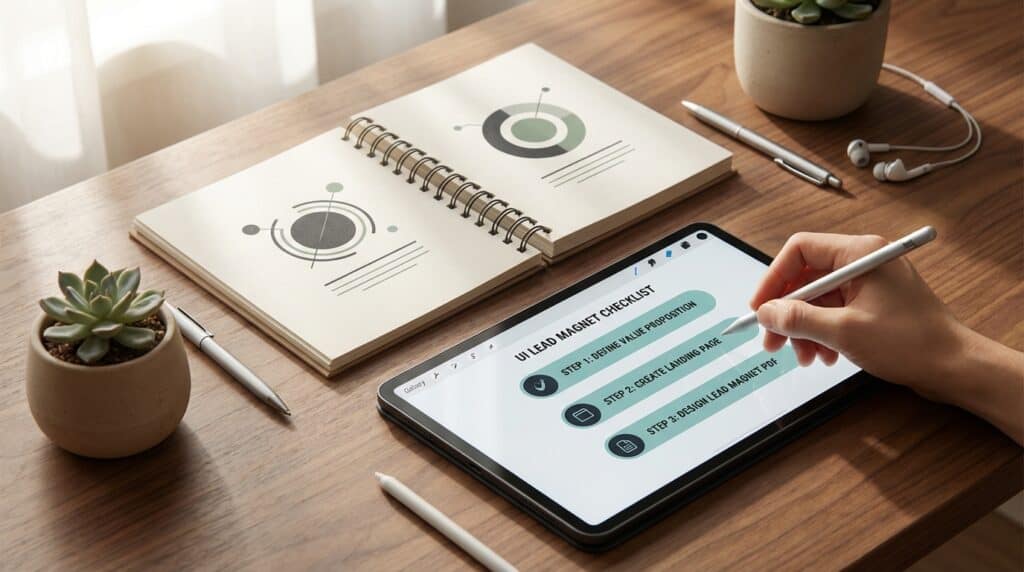
Visual Hierarchy and Layout for Immediate Utility
A lead magnet must do more than just provide information, it must be architected for immediate consumption and practical application. Marketing managers often struggle with high bounce rates because their resources feel like homework rather than a quick win. By implementing a clear visual hierarchy, you guide the reader through the content using bold headers, strategic white space, and logical flow. This structural clarity ensures that the most important takeaways are visible at a glance. When a prospect can scan your PDF or checklist and find value in under sixty seconds, the perceived quality of your brand increases instantly.
Visual aids like infographics and flowcharts are essential tools for transforming complex data into digestible insights. Instead of using dense blocks of text that overwhelm the user, utilize icons and callout boxes to highlight key steps or statistics. Professional lead magnet design should be woven throughout the design to establish authority without distracting from the core message. A clean layout reduces cognitive load, making it much more likely that the lead will actually use the resource. This immediate utility builds the necessary trust to move a prospect further down the conversion funnel.
The final layout should prioritize mobile responsiveness and accessibility to ensure the asset is functional across all devices. Large, touch friendly buttons and high contrast text prevent frustration for users on the go. Every design choice, from the font size to the placement of the call to action, should serve the goal of solving a specific problem quickly. When a lead magnet looks as professional as a paid product, it signals to your audience that your primary services are of equally high caliber. This commitment to aesthetic excellence directly correlates with higher top of funnel conversion rates.
Structural Elements of High-Converting Opt-In Pages

To maximize top of funnel conversion rates, the structural design of your opt-in page must prioritize a frictionless user experience that guides the visitor toward a single action. Professional aesthetics start with the removal of all global navigation menus and external links that might pull a prospect away from the offer. By eliminating these distractions, you create a focused environment where the lead magnet remains the sole center of attention. This architectural clarity signals authority and respect for the user’s time, which immediately builds trust before they even enter their information. High-converting pages utilize white space strategically to frame the value proposition and ensure the layout feels premium rather than cluttered.
The technical execution of the lead capture form is where many marketing managers lose potential conversions due to unnecessary friction. Data consistently shows that minimizing form fields to only the essentials, such as a name and email address, significantly increases completion rates. Every additional field creates a psychological barrier that can deter a busy professional from moving forward with the download. Beyond the form itself, your call to action buttons must be large and touch-friendly to accommodate the growing number of mobile users. Ensuring that these buttons use high-contrast colors and clear, benefit-driven copy will help bridge the gap between interest and action.
A truly professional delivery system considers the mobile experience as a primary design requirement rather than an afterthought. Elements like responsive scaling and finger-friendly spacing ensure that the structural integrity of your page remains intact across all devices. When the layout shifts seamlessly from desktop to smartphone, it reinforces the perception of a high-quality brand that pays attention to detail. Fast loading times and clean typography further enhance the user’s journey, making the transition from clicking an ad to receiving the resource feel instantaneous. By focusing on these structural fundamentals, you transform a standard landing page into a high-performance conversion asset.
Balancing Specificity and Aesthetic Authority in PDFs
High performance lead magnets like checklists and cheat sheets must strike a delicate balance between hyper specific utility and professional visual authority. While the content provides the solution to a prospect’s immediate pain point, the design serves as a silent signal of your brand’s expertise and reliability. Marketing managers often overlook the fact that a cluttered or amateurish PDF can undermine even the most insightful advice. By utilizing clean layouts, consistent brand colors, and ample white space, you transform a simple document into a high value asset. This visual polish ensures that your resource is not only downloaded but also respected as a credible extension of your core services.
Technical precision in short form assets requires a strategic use of typography and structural hierarchy to guide the reader’s eye quickly. High converting designs prioritize scannability by using bold headers, numbered lists, and touch friendly buttons that cater to both desktop and mobile users. Infographics and icons should be integrated to break up dense text, making complex information digestible within a five minute window. When a lead magnet looks as good as it functions, it builds the necessary trust to move a prospect further down the conversion funnel. A well designed PDF proves that your company pays attention to detail and values the user experience at every touchpoint.
Branding Consistency Across the Lead Nurturing Funnel

Maintaining a cohesive visual identity across your entire conversion path is essential for building immediate trust with new prospects. When a marketing manager clicks a professional ad, they expect the lead magnet, thank-you page, and subsequent email sequence to share a unified aesthetic. Disjointed design, such as mismatched color palettes or inconsistent typography, creates a jarring user experience that can signal a lack of professionalism. By standardizing your brand assets from the start, you reinforce your authority and reassure the lead that they are in the right place. This visual continuity acts as a silent trust signal that keeps the prospect engaged as they move deeper into your funnel.
The transition from the lead magnet download to the follow-up email sequence should feel like a natural extension of the same conversation. Your thank-you page is the perfect place to mirror the layout and imagery used within the PDF or resource itself to create a seamless bridge. Use the same high-quality icons, specific brand colors, and font hierarchies to ensure the lead recognizes your brand instantly in their crowded inbox. When your automated emails arrive, they should utilize a simplified version of this visual language to maintain a recognizable presence. This level of design consistency ensures your brand remains top of mind while reducing the friction that often leads to unsubscribes.
Strategic design choices help bridge the gap between initial interest and long term brand recall during the nurturing process. Every asset, from a checklist to a multi-page white paper, must function as a professional representation of your core services. If your lead magnet features clean infographics and a minimalist layout, your follow-up landing pages should adopt that same structural logic. Consistency across these touchpoints minimizes cognitive load for the user, making it easier for them to focus on your high-value insights. Ultimately, a well-designed funnel demonstrates that your business pays attention to detail, which significantly improves your top-of-funnel conversion rates.
Elevating Authority Through Professional Visual Design
Prioritizing design excellence is not merely about aesthetics but about establishing immediate credibility with your target audience. When a marketing manager delivers a lead magnet that features a clean layout, professional branding, and intuitive structural flow, it signals that the brand values quality in every interaction. This high level of visual polish transforms a simple PDF into a premium asset that reflects your internal standards of excellence. By investing in professional aesthetics, you move beyond generic content and create a top of funnel experience that stands out. This initial visual impression serves as the foundation for a long term relationship built on professional competence and attention to detail.
Solving a specific, urgent problem is the most effective way to validate the trust your prospects place in your brand. A well designed lead magnet avoids vague promises and instead offers a quick win through actionable insights or specialized templates. When a prospect downloads a resource that provides immediate utility, they associate your business with tangible results and expert authority. This strategic focus on specificity ensures that your lead generation efforts attract high quality prospects who are genuinely interested in your core solutions. By combining structural clarity with targeted problem solving, you create a conversion asset that nurtures leads effectively.
Professional design and high value content work together to bridge the gap between initial interest and lasting loyalty. A cohesive visual identity combined with a solution oriented approach eliminates friction in the buyer journey and encourages prospects to engage further. When your top of funnel assets look and function like premium products, you reduce the perceived risk of doing business with your company. This commitment to quality at the earliest stage of the funnel sets the tone for all future communications and sales interactions. Ultimately, a well executed lead magnet serves as a powerful testament to your brand’s reliability and its dedication to customer success.
Frequently Asked Questions
1. Why is professional design important for a lead magnet?
Professional design acts as the bridge between a casual visitor and a loyal subscriber by establishing immediate trust. When your resource reflects the quality of your core service through clean layouts, you eliminate friction and accelerate the path to conversion.
2. How can I prevent my lead magnet from being ignored?
You must prioritize visual clarity and immediate utility to ensure your resource provides a quick win in under ten minutes. By using a clear visual hierarchy with bold headers and strategic white space, you help the reader find value in under sixty seconds.
3. What is the best way to present complex information?
Avoid dense blocks of text that create a high cognitive load for your prospects. Instead, utilize visual aids like infographics, flowcharts, and callout boxes to transform complex data into digestible, actionable insights.
4. How do I ensure my lead magnet builds brand authority?
Establish authority by weaving professional branding throughout the design without distracting from the core message. A polished, mobile-friendly interface demonstrates excellence and proves that you are a high-quality solution provider.
5. What makes a lead magnet high-converting?
Focus on solving one specific problem for your prospect rather than offering generic advice. When you architect your resource for practical application and immediate consumption, you move the prospect from a simple exchange of information to a high-trust experience.
6. Why should I use icons and callout boxes in my PDF?
These elements are essential for highlighting key steps and statistics while reducing the feeling of homework for the reader. They help guide the user through a logical flow, making it much more likely that your lead will actually use and value the resource.