Dark mode has evolved from a developer-centric feature into a standard interface requirement. Originally a functional preference for coding in low light, it is now an expectation for general consumers. Users view this aesthetic as a necessary setting rather than an optional novelty. This shift reflects increased awareness of digital wellbeing and a desire for versatile viewing experiences. Designers must prioritize dark themes to ensure products feel complete.
Data supports this shift, showing that approximately 81.9% of Android users enable dark mode. This adoption rate indicates that a majority of audiences prefer darker interfaces for primary navigation. Ignoring this preference creates friction for users accustomed to dimmed screens. Major operating systems now integrate system-wide toggles that automatically adjust app appearances based on user settings. Applications failing to support this feature risk appearing outdated or harsh compared to adaptable competitors.
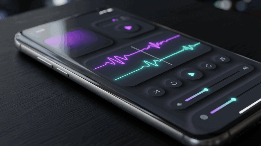
Dark interfaces have also reshaped digital product aesthetics. Deep grays and blacks allow vibrant accent colors to stand out, creating a sleek look that aligns with minimalist trends. This style offers a premium feel that enhances readability while reducing glare associated with white backgrounds. Brands leverage these darker palettes to convey elegance and focus. Mastering dark mode ensures a cohesive visual experience that respects both style and user comfort.
Key Takeaways
- Dark mode has transitioned from a niche feature to a standard user expectation, with data showing over 80% of users preferring it for visual comfort.
- Designers should prioritize dark gray surfaces (#121212) over pure black to reduce eye strain, prevent OLED smearing, and allow for better depth expression.
- Color palettes must be desaturated and lightened to prevent visual vibration against dark backgrounds while ensuring text meets WCAG accessibility contrast standards.
- Depth and hierarchy in dark interfaces should be established using lighter overlays to indicate elevation, as traditional drop shadows are ineffective.
Pure Black vs Dark Gray Surface Strategy
Many designers initially gravitate toward pure black (#000000) to maximize contrast and utilize modern display technology. On AMOLED and OLED screens, true black pixels turn off, leading to battery savings for mobile users. This approach creates visual depth where vibrant colors stand out. However, high contrast can be harsh for reading text, causing halation where white letters appear to bleed into the black background. Designers must weigh energy efficiency against potential visual fatigue caused by extreme contrast ratios.
To mitigate high contrast harshness, design systems like Google’s Material Design recommend dark gray (#121212) surfaces. Dark gray reduces eye strain by lowering the contrast differential between text and the background. This shift creates a sense of elevation and depth difficult to achieve on a flat black canvas. Gray also prevents black smearing, where pixels on OLED screens lag when changing from off to on. Keeping pixels active but dimmed ensures the interface remains responsive and visually stable during scrolling.
Desaturated Palettes and WCAG Contrast Standards

Using highly saturated colors on dark surfaces often leads to visual vibration. This optical effect occurs when bright, intense hues compete with the deep background, causing text or elements to appear as if they are shaking or blurring. To prevent eye strain, designers must shift away from vibrant colors used in light mode interfaces. Desaturating the color palette softens overall contrast, keeping content legible without feeling abrasive. Mixing white into accent colors creates pastel or muted tones that sit naturally against dark gray or black backdrops.
Creating a muted palette requires balancing saturation with accessibility standards. The Web Content Accessibility Guidelines (WCAG) recommend a minimum contrast ratio of 4.5:1 for normal text, which can be challenging with lower light reflectance. You can maintain compliance by lightening primary brand colors rather than reducing opacity. Checking modified shades against the background color using digital contrast tools is necessary during the design phase. This guarantees interactive elements remain distinct and readable for all users.
Elevation Hierarchies Through Lighter Overlays
Translating depth to a dark interface requires moving away from traditional drop shadows found in light themes. Since shadows rely on a bright background for visibility, they often disappear against deep grey or black surfaces. Instead of relying on darkness to create separation, designers must utilize light to indicate elevation. This method mimics how a light source illuminates an object held closer in a dim room. Brightening the background color of an element signals that it sits higher in the visual hierarchy than the surface behind it.
A common implementation involves applying white overlays with varying opacity levels to base colors. A background layer might sit at zero percent opacity, while a card on top utilizes a five percent white overlay for distinction. As elevation increases for components like navigation bars or floating action buttons, the opacity percentage rises. This technique allows original brand colors to show through while providing necessary contrast. Distinct opacity levels help users recognize which interactive elements are active.
Establishing a clear elevation system prevents the interface from looking flat. Without lighter tonal variations, users may struggle to identify boundaries between application sections. Properly layered surfaces guide the eye toward primary actions and modal windows without causing visual fatigue. Google Material Design utilizes this approach to maintain readability across its ecosystem of dark-themed apps. Using light to denote height creates a spatial model that feels intuitive for navigation in low-light settings.
Embracing Dark Mode as a Design Necessity
Dark mode has transitioned from an aesthetic preference to a core component of interface design. Users expect this feature as a standard offering to protect their vision during late-night usage. Ignoring this requirement can alienate audiences who prioritize digital well-being. Treating dark themes as a necessity ensures products remain competitive. Providing a high-quality dark interface demonstrates a commitment to meeting evolving user needs.
Prioritizing accessibility gives individuals the power to choose how they consume content based on their environment. A well-executed dark mode supports users with light sensitivity by offering contrast without the glare of white backgrounds. Implementing a toggle switch allows people to move between themes as lighting conditions change. This flexibility fosters an inclusive digital environment where usability is not compromised. Giving users control over their interface builds trust and encourages engagement.
Frequently Asked Questions
1. Why is dark mode considered a standard requirement now?
Dark mode has evolved from a developer preference into a baseline expectation. Users view this high-contrast aesthetic as a necessary setting for daily interactions rather than a novelty. Designers must prioritize it to ensure products feel complete.
2. How many users actually prefer dark interfaces?
Recent data shows that approximately 81.9% of Android users enable dark mode. This adoption rate demonstrates that a majority of audiences prefer a darker interface for primary navigation.
3. What happens if I do not include a dark mode option?
Ignoring this preference creates friction for users accustomed to the visual comfort of dimmed screens. Applications failing to support this feature risk looking outdated compared to adaptable competitors.
4. How does dark UI design impact aesthetics?
Deep grays and blacks allow vibrant accent colors to stand out while creating a sleek look. This visual style offers a premium feel that aligns with minimalist trends.
5. Does dark mode improve content readability?
Yes, it enhances readability while reducing the glare associated with white backgrounds. This approach offers a versatile viewing experience that supports digital wellbeing.
6. How do operating systems interact with app themes?
Major operating systems have integrated system-wide toggles that automatically adjust app appearances based on user settings. Designs should respond to these cues to provide a consistent experience.
7. Why are brands adopting darker color palettes?
Brands leverage darker palettes to convey focus and help applications stand out. This design choice creates a sophisticated atmosphere associated with high-quality products.