With median monthly churn hovering around 4%, your product interface is often the line between growth and stagnation. Up to 80% of voluntary departures stem from friction during onboarding and confusing navigation, making saas churn reduction ux a priority for 2025. When users fail to grasp a product’s value within minutes, they rarely return.
Optimizing user experience can reduce churn by up to 22% by accelerating the time to value for new sign-ups. Top-performing SaaS firms achieve retention rates of 1% to 2% by treating every click as a potential point of failure. Reducing churn by even a small margin can boost long-term profits by up to 95%, transforming a leaky bucket into a compounding revenue engine.
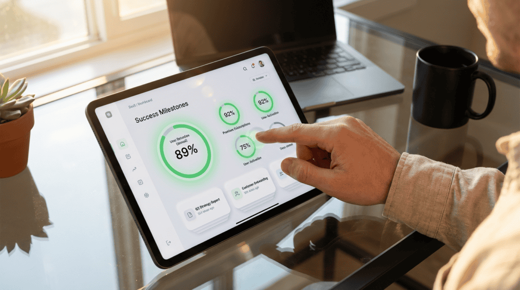
Key Takeaways
- Optimizing user experience to accelerate time to value can reduce voluntary churn by up to 22% and boost long-term profits by as much as 95%.
- Strategic friction in the cancellation flow, such as multi-step feedback surveys and data-driven visualizations, can recover nearly a quarter of users intending to leave.
- Offering flexible alternatives to cancellation, like subscription pauses or discounted maintenance modes, prevents permanent data loss and simplifies future account reactivation.
- Proactive feature discovery and contextual guidance prevent churn by identifying inactive users and highlighting high-value tools before they reach the point of cancellation.
Optimizing the Cancellation Flow with Strategic UX Friction
Strategic UX friction during offboarding is about creating a meaningful dialogue before a user departs. Instead of using hidden or complex patterns that frustrate customers, high-performing SaaS companies implement a multi-step flow to gather qualitative data. By asking a single, well-timed question about why a user is leaving, you can trigger personalized save plays based on their specific pain point. This approach transforms a cold exit into an opportunity for resolution, often uncovering issues that a simple UI adjustment or a brief tutorial can fix.
Effective churn reduction design often incorporates flexible alternatives to total cancellation, such as the option to pause a subscription or downgrade to a lower tier. If a user cites budget constraints, a strategic UX flow might surface a discounted maintenance mode that keeps their data intact for a small fee. This prevents the permanent loss of account history and makes it significantly easier for the user to reactivate their plan later. Providing these options shows respect for the user’s changing needs while protecting monthly recurring revenue.
The final stage of a thoughtful cancellation flow should emphasize the value the user is leaving behind through clear, data-driven visualizations. Summarizing account achievements or showing a preview of the data they will lose can trigger a powerful psychological pause. You can also offer a direct line to a success manager or a link to a specific help article that addresses their reason for leaving. When these elements are designed with empathy and precision, businesses can recover up to 22 percent of users who intended to cancel.
Accelerating Time to Value Through Frictionless Onboarding

Reducing initial friction is a defensive strategy against early-stage churn. When a new user encounters a complex dashboard or long lists of required fields, their cognitive load increases, leading to immediate drop-offs. By streamlining the friction during onboarding path, you help users reach their time to value within the first few clicks. This is critical since statistics show that 80% of users uninstall software they do not understand within minutes. A frictionless experience ensures that the perceived value of the product outweighs the effort required to learn it.
To accelerate time to value, designers must implement patterns that anticipate and remove navigation barriers before they cause frustration. This involves using progressive disclosure to hide advanced features while highlighting the core functionality that solves the user’s immediate problem. Successful SaaS companies often use interactive walkthroughs and pre-filled templates to guide users toward a quick win. These targeted UX strategies can reduce voluntary churn by 10% to 22% by ensuring the user feels successful from their first session.
While most onboarding focuses on the welcome sequence, true friction reduction also addresses moments where users feel lost or stuck. Implementing contextual tooltips and real-time support within the interface prevents the cognitive fatigue that leads to account cancellation. If a user can navigate your platform intuitively, they are far less likely to seek out competitors with simpler interfaces. By prioritizing a clean and guided user journey, you build the necessary momentum to transition a trial user into a loyal advocate.
Implementing Contextual Guidance and Feature Discovery Patterns
Proactive feature discovery serves as a defense when a user begins to drift toward cancellation. Instead of waiting for a user to click the delete button, automated tooltips can identify patterns of inactivity and highlight high-value features that the user has yet to explore. These contextual cues act as a strategic re-engagement tool by demonstrating utility right when interest begins to wane. By transforming empty states into guided roadmaps, you can replace confusion with a clear path toward the core value proposition.
Effective churn reduction requires a UI that recognizes when a user is struggling and intervenes with precision. Rather than overwhelming the dashboard with generic popups, modern SaaS platforms use proactive UI cues to nudge users toward underutilized tools that correlate with long-term retention. When these patterns are integrated directly into the workflow, they reduce the friction that typically leads to voluntary churn. High-performing companies leverage these subtle design interventions to keep users within the ecosystem by constantly reinforcing evolving benefits.
The most critical moment for contextual guidance often occurs during the offboarding process itself. By implementing smart discovery patterns within the cancellation interface, companies can remind users of the specific features they are walking away from. This strategy uses data to present personalized alternatives, such as a targeted tutorial or a discounted tier, based on the user’s unique behavior history. When UX design prioritizes these meaningful interactions, it can successfully recover a significant percentage of users who were previously determined to leave.
Turn Your Cancellation Flow Into a Retention Asset
Transforming your cancellation flow from an exit point into a strategic retention asset is the final piece of the SaaS growth puzzle. Instead of letting users slip away through a generic cancel button, a data-driven UX approach allows you to implement smart design patterns that address specific pain points in real time. By offering personalized alternatives like account pauses, discounted tiers, or targeted feature walkthroughs, you can capture the 10% to 22% of users who would otherwise churn due to temporary friction. This shift ensures the exit journey becomes a diagnostic tool that uncovers exactly where product value might be falling short for specific segments.
Building a sustainable growth engine requires viewing every user interaction, especially the desire to leave, as an opportunity for optimization. When you leverage enhanced UX and churn prediction models, you can proactively intervene with the right message before the user reaches the cancellation screen. Since even a 5% reduction in churn can boost overall profits by up to 95%, these small design adjustments during the exit flow yield significant financial returns. A seamless, empathetic, and data-backed offboarding experience preserves the brand relationship and keeps the door open for future reactivation.
Mastering SaaS churn reduction through UX is about proving value at every touchpoint of the customer lifecycle. High-performing companies that maintain low voluntary churn rates do so by removing navigation friction and ensuring users reach their aha moment early and often. By refining retention patterns, you protect recurring revenue and stabilize your market position. Commitment to a user-centric exit strategy ensures that your product remains competitive as customer expectations for intuitive software continue to rise.
Frequently Asked Questions
1. How does UX design directly impact SaaS churn rates?
The product interface acts as the primary driver of retention because friction in onboarding and navigation causes up to 80% of voluntary departures. By optimizing these touchpoints to accelerate time to value, you can reduce churn by as much as 22%.
2. What is the benefit of adding friction to the cancellation process?
Strategic friction allows you to open a dialogue with departing users rather than letting them leave silently. By implementing a multi-step flow that asks for feedback, you can trigger personalized save plays or surface solutions that address their specific reasons for leaving.
3. How can I prevent permanent account loss during offboarding?
You should offer flexible alternatives to cancellation such as a subscription pause or a low-cost maintenance mode. These options keep user data intact and lower the barrier for customers to reactivate their accounts when their circumstances change.
4. What is a healthy churn rate for a growing SaaS company?
While the median monthly churn is around 4%, elite SaaS firms aim for a retention rate of 1% to 2%. Reaching these benchmarks requires you to treat every click as a potential point of failure and continuously refine the user journey.
5. Can small improvements in UX really affect long term profitability?
Yes, even marginal reductions in churn can boost long-term profits by up to 95%. Transforming your product from a leaky bucket into a compounding revenue engine is the most effective way to ensure sustainable growth.
6. What is the danger of using dark patterns in offboarding?
Hidden or overly complex cancellation buttons frustrate users and damage your brand reputation. You should focus on transparent, helpful UX that gathers qualitative data to fix underlying product issues instead of trapping users.
7. How do I identify which UI elements are causing churn?
You must monitor where users struggle during onboarding and identify points where they fail to grasp the product value within minutes. Using qualitative feedback from cancellation flows can help you pinpoint specific UI adjustments or tutorials needed to bridge the gap.