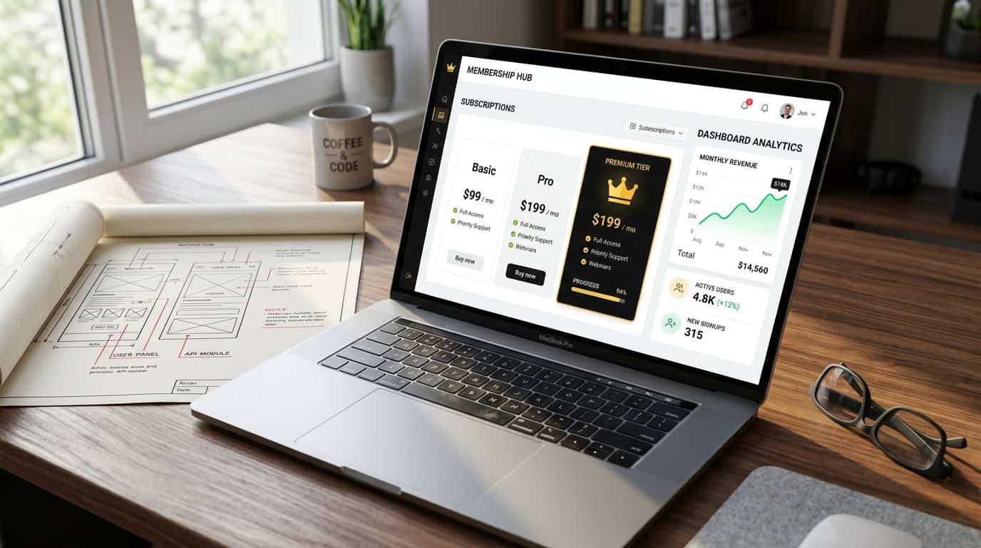
Static, cluttered SaaS dashboards once felt more like data graveyards than command centers. These interfaces were a dense wall of passive charts and endless tables, leaving users to decipher what was important. That paradigm has shifted toward clean, minimalist, and action-driven design. A modern dashboard empowers users by presenting the right information at the right time, guiding them toward their next valuable action. It has evolved from a passive report into an interactive workspace that contributes to user success.
A well-designed dashboard is more than a feature; it is a strategic asset for user success and business growth. When a new user logs in, the dashboard serves as their primary guide, showcasing immediate value and simplifying the learning curve. This positive first impression is crucial for long-term retention, as the interface becomes a critical tool for daily decision-making. Effective design anticipates user needs by presenting relevant insights and clear calls-to-action that drive engagement and reduce churn. It transforms raw data into a clear path forward, making it an indispensable part of the user experience.
Intelligent interfaces combine powerful technology with user-centric design principles. AI-powered personalization, for example, dynamically tailors the layout and insights to a user’s role and behavior, making the experience relevant. This is complemented by real-time data updates and customizable widgets, allowing users to build a command center that matches their workflow. Interactive visualizations provide deeper insights on demand, while seamless integrations centralize information from other business systems. Together, these elements create an experience that is not just informative but empowering.
Key Takeaways
- Modern SaaS dashboards have evolved from static, cluttered ‘data graveyards’ into clean, action-driven command centers that guide users toward valuable actions.
- A well-designed dashboard is a strategic asset that directly impacts business growth by improving user retention and reducing churn.
- AI-powered personalization is crucial, as it dynamically tailors the layout and insights to a user’s specific role and behavior, making the experience more relevant and intuitive.
- Users are empowered through modular design with customizable widgets and interactive visualizations, allowing them to build a personalized workspace and explore data on demand.
- Effective dashboards act as a central hub by seamlessly integrating with other business systems (like CRMs or ERPs) to create a single, unified source of truth.
- The design philosophy has shifted to a minimalist approach that prioritizes clarity and a clear visual hierarchy to reduce cognitive load and focus user attention.
From Data Dump to Action-Driven Hub
The era of the “data dump” dashboard, where users were flooded with every possible metric, is over. Modern design philosophy champions a minimalist approach, prioritizing clarity and reducing cognitive load. By establishing a clear visual hierarchy, platforms guide attention toward the most critical information and primary calls to action. Dropbox’s clean interface, for example, focuses you on recent files and core tasks like uploading or sharing, rather than displaying complex storage analytics upfront. This strategic simplicity transforms the dashboard from a passive reporting tool into an active, task-oriented hub that encourages engagement.
Effective dashboards are also personalized and dynamic. AI-powered personalization adapts layouts and insights based on a user’s role and past behavior. A sales leader might see revenue targets and team performance, while a marketer sees campaign ROI, all within the same platform. Combined with real-time data updates and customizable widgets, the interface becomes a living workspace that anticipates needs and streamlines workflows. The goal is no longer to just present information, but to deliver the right insights at the right moment to prompt decisive action.
Modular Widgets and Interactive Data Visualization

A modern SaaS dashboard’s foundation is its modular design, which treats every piece of information as a distinct, customizable widget. Users can build their ideal workspace by dragging and dropping elements like key performance indicators, task lists, or recent activity feeds. This personalization empowers individuals to prioritize the data most relevant to their role, cutting through the noise. AI-powered platforms can even suggest a tailored layout based on a user’s behavior, ensuring critical insights are always visible. This approach transforms a generic dashboard into a focused, action-driven command center.
Effective dashboards use dynamic, interactive visualizations that invite exploration. Instead of presenting static numbers, modern interfaces use charts and graphs that users can directly manipulate. A user can click a segment of a pie chart or a peak in a line graph to examine the granular data behind the summary. This capability, supported by real-time data updates, allows for immediate investigation and confident decision-making without leaving the dashboard. Enabling users to ask and answer their own questions fosters discovery and mastery over the platform, turning passive viewing into an active, engaging experience.
AI-Powered Personalization and System Integration
Intelligent SaaS dashboards use artificial intelligence to deliver a personalized user experience. Instead of a generic layout, AI dynamically adjusts the interface based on a user’s role, behavior, and frequently accessed data. For instance, a sales manager might see a dashboard focused on team performance metrics and pipeline health, while a marketing lead’s view prioritizes campaign ROI and lead generation funnels. This tailored approach ensures the most relevant, action-driven insights are always visible, reducing cognitive load and making the platform more intuitive. By predicting user needs, AI transforms the dashboard from a static report into a proactive, intelligent assistant.
Beyond individual personalization, a dashboard’s power is magnified through seamless system integration. Information siloed in different business tools like a CRM, ERP, or accounting software creates a fragmented view of performance. Effective SaaS dashboards act as a central hub, pulling real-time data from these disparate sources into one unified, interactive interface. This creates a single source of truth, empowering teams to make holistic, data-informed decisions without constantly switching between applications. This integration streamlines workflows and provides the comprehensive analytical view crucial for strategic planning.
From Static Reports to Intelligent Partners
The era of static, one-size-fits-all SaaS dashboards is over. Modern dashboards have evolved into dynamic, intelligent command centers that actively guide user behavior instead of just presenting data. By using AI-powered personalization and real-time data updates, these interfaces anticipate user needs and surface the most relevant insights at the right moment. This shift transforms the dashboard from a passive reporting tool into an indispensable partner in a user’s daily workflow. Interactive visualizations and deep integration capabilities further empower users to explore information and make decisions without leaving the platform.
Investing in a clean, focused, and action-oriented dashboard design is a critical business imperative. An intuitive and personalized experience directly impacts user satisfaction and reduces the friction that leads to churn. When users can immediately see value, customize their view with modular widgets, and take meaningful action, their engagement and loyalty deepen. A well-designed dashboard is the most powerful tool for demonstrating your product’s value daily, proving its worth with every login.
Frequently Asked Questions
1. What is the primary goal of modern SaaS dashboard design?
The primary goal is to empower you by presenting the right information at the right time. It transforms a passive report into an interactive workspace that guides you toward valuable actions and helps you succeed.
2. Why is a good dashboard considered a strategic asset?
A well-designed dashboard is a strategic asset because it directly drives user success and business growth. By simplifying the learning curve and showing immediate value, it becomes a critical tool for daily decision-making and long-term retention.
3. How have SaaS dashboards evolved?
Dashboards have transformed from static, cluttered “data graveyards” into clean, minimalist, and action-driven command centers. The focus has shifted from passively displaying dense data to actively guiding you toward important insights and decisions.
4. What makes a dashboard ‘action-driven’?
An action-driven dashboard anticipates your needs by presenting relevant insights alongside clear calls-to-action. Instead of showing you data, it helps you understand what to do next, turning raw information into a clear path forward.
5. What are the key elements of an effective modern dashboard?
Effective dashboards combine user-centric design with powerful technology like AI-powered personalization and real-time data updates. They also include customizable widgets, interactive visualizations, and seamless integrations to create a command center tailored to your workflow.
6. How does a well-designed dashboard help reduce user churn?
A well-designed dashboard creates a positive initial experience and quickly becomes an indispensable tool for your daily work. By consistently delivering value and making your job easier, it drives engagement and reinforces the product’s importance, which boosts long-term retention.


