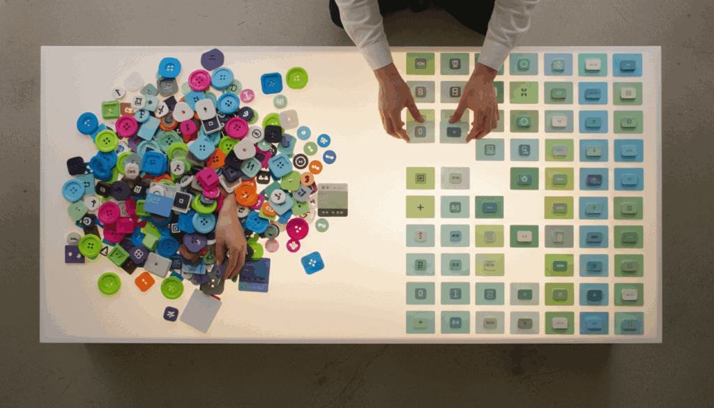
A design system is more than a style guide; it’s the single source of truth that unifies product development across an organization. It is a comprehensive library of reusable components, design tokens, and clear standards for both designers and developers. This collection contains everything needed to build a product, from the smallest visual element like a color value to a complex, fully coded component. By centralizing these assets, teams ensure consistency across all user interfaces, eliminating guesswork and redundant work. This shared language is fundamental for creating a cohesive user experience as a company scales.
As organizations grow, maintaining visual and functional consistency becomes a significant challenge that can slow innovation. Without a design system, teams often work in silos, leading to fragmented user experiences and “design drift” where products slowly diverge from their original intent. A well-implemented system bridges the gap between design and development by providing a shared toolkit and documented guidelines. Developers can pull pre-built, tested components, while designers can focus on solving complex user problems instead of recreating basic UI elements. This streamlined process accelerates production, reduces bugs, and makes onboarding new team members more efficient.
A robust design system is built on structured, modular components that offer both flexibility and control. The base layer consists of design tokens, which are named variables for foundational values like colors, spacing, and typography. These tokens are then used to build larger, reusable UI components such as buttons, cards, and navigation bars. Comprehensive documentation and clear usage guidelines explain how and when to use each part of the system. This layered approach ensures that every element is purposeful and contributes to a scalable, maintainable, and consistent product ecosystem.
Key Takeaways
- A design system is a single source of truth with reusable components and standards that unifies design and development, preventing inconsistent user experiences as a company scales.
- It provides significant business value by accelerating time to market and reducing long-term costs, as teams can build faster using a library of pre-approved, reusable assets.
- The system’s foundation is built on design tokens—variables for core styles like color and spacing—which make global brand updates efficient and maintainable across all products.
- It bridges the gap between design and development by providing a shared toolkit, allowing designers to focus on user problems and developers to build with pre-tested components.
- For long-term success, a design system must be treated as a living product with a clear governance model for updates, rather than a static, one-off project.
- Successful adoption is critical and is achieved by involving teams in the creation process to foster shared ownership and by providing comprehensive documentation and support.
The Business Case for a System
A design system is a powerful strategy for accelerating your time to market. By providing a library of pre-built, pre-approved UI components and clear guidelines, teams can bypass redundant design and coding cycles. Designers and developers no longer need to reinvent the button or debate spacing for every new feature, drastically cutting down on decision-making time. This allows teams to rapidly assemble new pages and prototypes, shifting focus from foundational elements to solving complex user problems. This agility enables businesses to respond faster to market changes and ship valuable updates to customers more frequently.
The operational efficiency gained from a design system translates directly into significant long-term cost reductions. Companies report dramatic decreases in the hours spent on design and development for new projects, as teams are building with established, reusable assets. This centralized approach also minimizes “design debt” and simplifies maintenance, since updates to a component can be propagated across all products simultaneously. A unified user interface reduces customer confusion and builds brand trust, which can lower support tickets and associated costs. These savings free up valuable budget and resources, allowing your organization to invest in innovation rather than repetitive maintenance.
Laying the Foundation with Core Components

A powerful design system begins with a solid foundation of design tokens. These tokens are named variables that store core visual design attributes, such as a specific hex code for a primary brand color or the pixel value for standard padding. Instead of hard-coding values like #4A90E2, your team can use a token like color-brand-primary across both design files and codebases. This approach ensures consistency and makes updating your entire product’s look and feel as simple as changing a single token value. By abstracting these fundamental decisions, you create a scalable and maintainable visual language. This foundational layer becomes the single source of truth for your brand’s aesthetics.
With your design tokens in place, you can begin constructing the visible building blocks of your user interface: the components. These are reusable UI elements, such as buttons, input fields, and navigation bars, all styled using the tokens you previously defined. Organizing these elements using a modular approach like Atomic Design helps create a clear hierarchy from the smallest atoms to complex organisms. This library of pre-built, pre-approved components empowers your teams to build new features quickly without reinventing the wheel. The result is a cohesive and predictable user experience across all your digital products.
Comprehensive documentation brings a design system to life. A well-documented style guide clearly outlines how to use your color palettes, typography scales, and spacing rules effectively. It should also include guidelines on accessibility, voice and tone, and interaction patterns to ensure everyone is building with the same principles in mind. This documentation serves as a central hub of knowledge, helping new team members get up to speed quickly. These standards and guidelines provide the “why” behind your design decisions, fostering a shared understanding across your organization.
A Practical Step-by-Step Building Plan
Begin with a thorough interface audit to take stock of your existing products. This process involves cataloging every unique UI element, from buttons and form fields to color variations, across all your products to spot inconsistencies and identify recurring patterns. After the audit, collaborate with your team to establish a core set of design principles that will act as your constitution. These guiding values, such as “clarity over cleverness” or “accessible by default,” will inform every future decision on aesthetics and functionality. This foundational work is crucial for ensuring your design system is built on a shared, strategic vision.
With your principles defined, the next phase is to translate them into tangible design tokens. These tokens are the foundational variables for visual properties like your color palette, typography scales, and spacing units, creating a single source of truth for both design and code. From there, you can begin constructing your first pilot components, often starting with foundational “atoms” like buttons, icons, and input fields. Focus on building and documenting these initial elements perfectly, as they will validate your process and set the quality standard for everything that follows. This iterative approach allows you to gain momentum and demonstrate value early on.
Ensuring Adoption and Long-Term Success

A technically perfect design system will fail without genuine team buy-in from the people who use it daily. To foster adoption, involve designers and engineers from various product teams in the creation process to create a sense of shared ownership. These early participants often become your most powerful advocates, championing the system within their own teams. Establish clear communication channels, like a dedicated Slack channel or weekly office hours, to provide support and actively gather feedback. Comprehensive documentation and robust onboarding make using the system the path of least resistance.
Treating your design system as a living product, rather than a one-off project, is fundamental to its long-term success. This requires establishing a clear governance model that defines who can contribute, how changes are proposed, and the process for approving new components or patterns. Whether managed by a dedicated core team or a federated group of representatives, a formal process prevents the system from becoming inconsistent or outdated. Communicating updates through detailed release notes and maintaining a public roadmap ensures all stakeholders understand the system’s evolution. This proactive maintenance transforms the system from a static library into a dynamic tool that grows with your products.
Conclusion
Building a design system creates a shared language that unifies the product development process. It combines design tokens, reusable components, and clear documentation to establish a single source of truth for designers and developers. This foundational structure eliminates guesswork and redundant work, allowing teams to collaborate more effectively and ship features faster. By investing in this system, you are investing in the long-term health, scalability, and consistency of your digital products.
A design system is not a one-time project but an evolving product that grows with your organization. The most successful implementations begin small, focusing on high-impact elements like color palettes, typography, or a universal button component to prove value early. This iterative approach allows you to demonstrate tangible benefits quickly and build the momentum needed for broader adoption. This continuous process of feedback and refinement ensures your design system delivers lasting impact across every user touchpoint.
Frequently Asked Questions
1. Isn’t a design system just another name for a style guide?
A design system is more than a style guide. While a style guide dictates visual standards, a design system is a functional library of reusable components, design tokens, and clear guidelines for both designers and developers.
2. What is the main benefit of implementing a design system?
The primary benefit is creating a unified and consistent user experience across all your products, especially as your organization scales. It eliminates fragmented designs and redundant work by providing a shared language and toolkit, allowing your teams to innovate faster.
3. How does a design system speed up the development process?
It accelerates production by providing developers with a library of pre-built, tested components. Instead of coding basic UI elements from scratch, they can pull them from the system, which reduces bugs and frees them up to focus on solving more complex user problems.
4. What are ‘design tokens’?
Design tokens are named variables for core design values like colors, spacing, and typography. By using tokens, you can make global brand updates efficiently by changing a single value, ensuring consistency everywhere.
5. Who in an organization actually uses the design system?
A design system is used by both design and development teams. Designers use it to create consistent mockups, while developers use its coded components to build the final product, ensuring everyone is working from the same toolkit.
6. How does a design system prevent ‘design drift’?
It prevents ‘design drift’ by centralizing all UI components and standards into one place. Without a shared system, teams often work in silos and products slowly diverge from their original intent. A design system ensures everyone follows the same rules, maintaining a cohesive experience.
7. Is a design system only for large organizations?
While essential for scaling, a design system provides value for organizations of any size. Implementing one early establishes a foundation for consistency and efficiency, streamlining your workflow and preventing the fragmented experiences that can occur as your team and product grow.
